
Menu layout
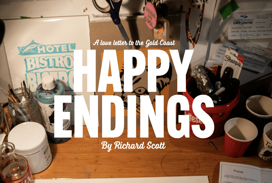
Commissioned by artist, Richard Scott, I created the branding for his solo show; Happy Endings, A love letter to the Gold Coast. Showcasing his screen-printed series depicting massage parlours to snack bars and the iconic Pink Hotel, preserving the nostalgic mementos of the Gold Coast before it’s too late.
Starting this project with Richard came with two chicken scratch sketches, an idea of a rough poster layout and a Chinese takeaway menu he collected on his recent trip to Bali. A great start.
With a hero image selected it was crucial for the design to create something that was bold and inviting but maintained the vintage-esque approach that aligned with the project. His illustration of a massage parlour (tie to the Happy Endings title) was a large san-serif font and the blocky shadows and details of kick signs and brittle sun aged signage. So I picked a sanserif for the main title, just with a bit more ‘UMPH’ (the cousin design term of, make it pop!).
Paired with the inspirations of vintage newsletter clippings, match boxes and a Chinese takeout menu pamphlet, came the paring of a script font to almost act as a visual representation, exchange of letters between old fashioned lovers.
I developed the Layout that took the form of a Chinese takeaway menu, this featured the work and the beverages offered by sponsors on the night. It was important lesson within the project working aligned with other brand style guides and understanding logo usage guides.
The project in total consisted of a series of shirts, posters pasted in the surrounding areas, stickers, drink coasters doubling as business cards, the pamphlets and a kick stand sign; collaboration of 3 people who never made a kickstand, one who screwed the hinges the wrong way, twice. Another on their way to make a third Officeworks trip. The next, actually painting the sign, and their clothes, myself.

Commissioned by artist, Richard Scott, I created the branding for his solo show; Happy Endings, A love letter to the Gold Coast. Showcasing his screen-printed series depicting massage parlours to snack bars and the iconic Pink Hotel, preserving the nostalgic mementos of the Gold Coast before it’s too late.
Starting this project with Richard came with two chicken scratch sketches, an idea of a rough poster layout and a Chinese takeaway menu he collected on his recent trip to Bali. A great start.
Menu layout
With a hero image selected it was crucial for the design to create something that was bold and inviting but maintained the vintage-esque approach that aligned with the project. His illustration of a massage parlour (tie to the Happy Endings title) was a large san-serif font and the blocky shadows and details of kick signs and brittle sun aged signage. So I picked a sanserif for the main title, just with a bit more ‘UMPH’ (the cousin design term of, make it pop!).
Paired with the inspirations of vintage newsletter clippings, match boxes and a Chinese takeout menu pamphlet, came the paring of a script font to almost act as a visual representation, exchange of letters between old fashioned lovers.
I developed the Layout that took the form of a Chinese takeaway menu, this featured the work and the beverages offered by sponsors on the night. It was important lesson within the project working aligned with other brand style guides and understanding logo usage guides.
The project in total consisted of a series of shirts, posters pasted in the surrounding areas, stickers, drink coasters doubling as business cards, the pamphlets and a kick stand sign; collaboration of 3 people who never made a kickstand, one who screwed the hinges the wrong way, twice. Another on their way to make a third Officeworks trip. The next, actually painting the sign, and their clothes, myself.
Commissioned by artist, Richard Scott, I created the branding for his solo show; Happy Endings, A love letter to the Gold Coast. Showcasing his screen-printed series depicting massage parlours to snack bars and the iconic Pink Hotel, preserving the nostalgic mementos of the Gold Coast before it’s too late.
Starting this project with Richard came with two chicken scratch sketches, an idea of a rough poster layout and a Chinese takeaway menu he collected on his recent trip to Bali. A great start.
Commissioned by artist, Richard Scott, I created the branding for his solo show; Happy Endings, A love letter to the Gold Coast. Showcasing his screen-printed series depicting massage parlours to snack bars and the iconic Pink Hotel, preserving the nostalgic mementos of the Gold Coast before it’s too late.
Starting this project with Richard came with two chicken scratch sketches, an idea of a rough poster layout and a Chinese takeaway menu he collected on his recent trip to Bali. A great start.
Menu layout
With a hero image selected it was crucial for the design to create something that was bold and inviting but maintained the vintage-esque approach that aligned with the project. His illustration of a massage parlour (tie to the Happy Endings title) was a large san-serif font and the blocky shadows and details of kick signs and brittle sun aged signage. So I picked a sanserif for the main title, just with a bit more ‘UMPH’ (the cousin design term of, make it pop!).
Paired with the inspirations of vintage newsletter clippings, match boxes and a Chinese takeout menu pamphlet, came the paring of a script font to almost act as a visual representation, exchange of letters between old fashioned lovers.
I developed the Layout that took the form of a Chinese takeaway menu, this featured the work and the beverages offered by sponsors on the night. It was important lesson within the project working aligned with other brand style guides and understanding logo usage guides.
The project in total consisted of a series of shirts, posters pasted in the surrounding areas, stickers, drink coasters doubling as business cards, the pamphlets and a kick stand sign; collaboration of 3 people who never made a kickstand, one who screwed the hinges the wrong way, twice. Another on their way to make a third Officeworks trip. The next, actually painting the sign, and their clothes, myself.
Commissioned by artist, Richard Scott, I created the branding for his solo show; Happy Endings, A love letter to the Gold Coast. Showcasing his screen-printed series depicting massage parlours to snack bars and the iconic Pink Hotel, preserving the nostalgic mementos of the Gold Coast before it’s too late.
Starting this project with Richard came with two chicken scratch sketches, an idea of a rough poster layout and a Chinese takeaway menu he collected on his recent trip to Bali. A great start.